welcome!

A UX/UI design & branding agency for a digital-first world.

At Designer and Gentleman, we use a human-centric approach to create brands that people love.

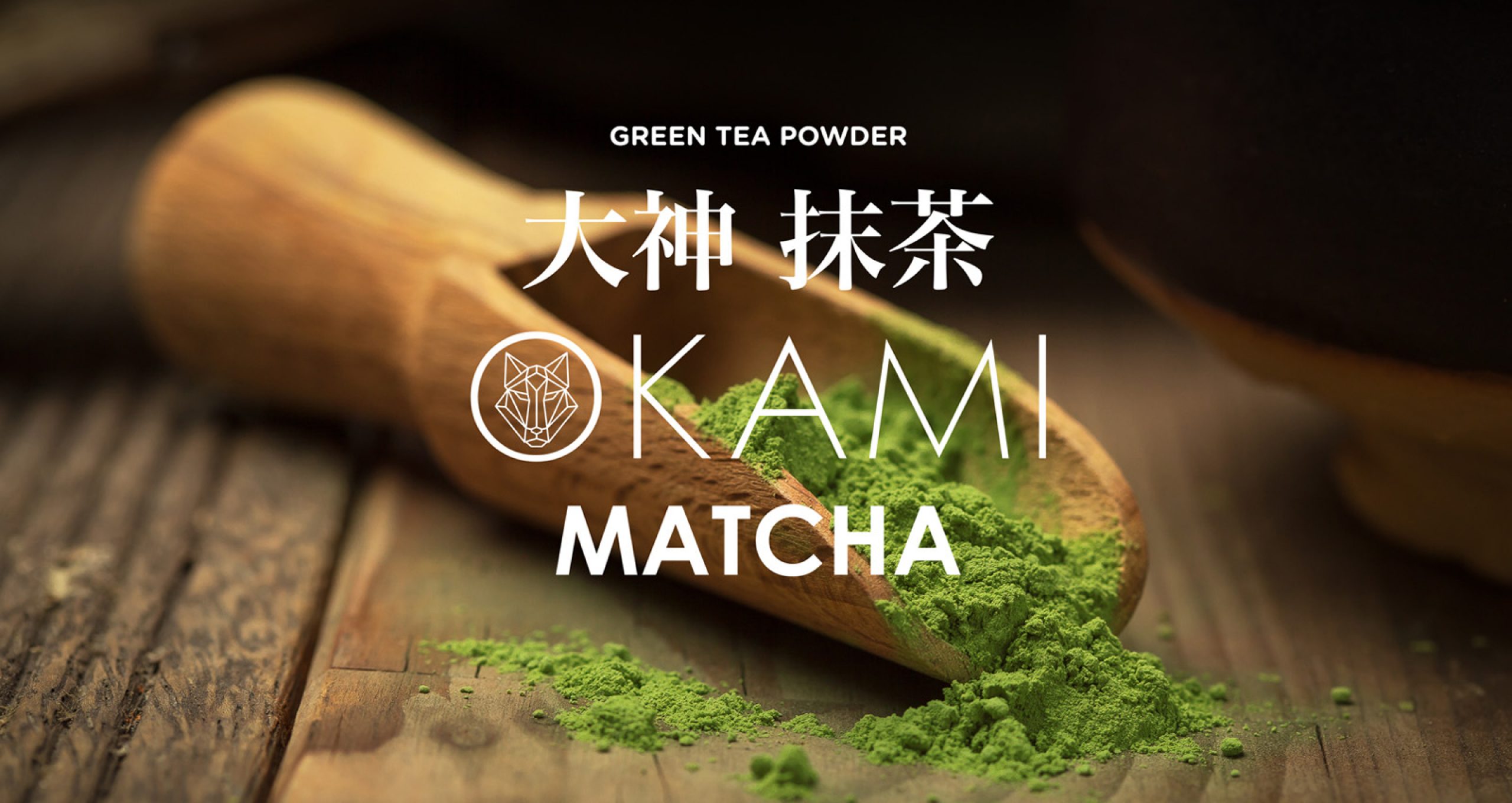
Okami Matcha

How did we succeed in creating a successful and highly profitable Matcha brand in a market that is more used to with coffee than tea?

okami-macha-logo
  • Client:

    Okami Matcha

  • Duration:

    6 months

  • Services:

    Strategy
    Brand Positioning
    Packaging System
    POS
    EBC
    E-Commerce

  • Awards:

    GDUSA Packaging Award

Introduction

The brief was to create edgy modern and interesting packaging design for 100% fine ground powdered high quality Matcha tea. This matcha comes from its original region- Japan where the best matcha in the world is grown. Okami means wolf in Japanese, so we created a brand identity with a stylized wolf icon. The main challenge was to combine traditional Japanese spirit and contemporary graphic language. Our focus was on the message: ”ONE GLASS OF MATCHA IS EQUIVALENT TO TEN GLASSES OF REGULAR GREEN TEA”

group-3330815-min-2

Research 

What we don’t like is when the websites we visit suddenly change their interface, even if it’s just having round buttons instead of square now, especially where our social media platforms are concerned.

We don’t like it when our supermarkets overhaul their layout and suddenly our well-established route from the obligatory vegetables to the inevitable snacks includes a detour. Speaking of which, we don’t like random changes to the familiar, beloved packaging that has withstood the test of time.

We know our banks may not be the best out there, and we’re sure there are other ones who would be a better fit, but it’s just too much of a hassle to change, and our passive loyalty wins over.

We still use the floppy disk as a Save icon, for goodness sake. If it ain’t broke, don’t fix it, right?

mask-group-3

But here’s the kicker – one of the most important human traits is our flexibility. We have survived for as long as we have precisely because we can adjust to just about anything. We just don’t like to, and this is why we are particularly proud of the Okami Matcha project.

As we have had the opportunity to see, people are pretty set in their ways sometimes, and this is especially true for Serbians, who have their own particular brand of stubborn. For centuries now, the drink of choice for any and all occasions in Serbia has been coffee. It’s the first thing you’re offered at any Serbian household worth its salt, and conversely, it’s what you bring as a gift when you visit someone’s home for the first time.

And tea? Well, tea is something you have when you’re sick, of course. Why else would you drink something like that when you could have a nice cup of coffee or something stronger?

Here lay our challenge: to warm up the Serbian people to the idea that tea is so much more than something bland that you’re forced to drink when you’re not feeling well. To penetrate the market that has long been used to coffee and introduce it to a preferable alternative, a type of tea that will break stereotypes and rise above all else.

mask-group-4

The Brief

Matcha originally comes from Japan, where (like coffee in Serbia) it had been enjoyed for centuries – and for a very good reason. The Japanese are famous for their good health and longevity, with an average life expectancy of 84 years, as opposed to the US (78 years) or Serbia (75 years). We can trust their diet choices.

Matcha is no different. It is full of vitamins, antioxidants, catechins, it works well with your metabolism, and it gives you the energy boost needed without the eventual crash. It comes in the form of a powder, which provides us with incredible versatility and choice in how we use it. Not only can we use it to make a solid cup of tea, we can also include it as seasoning in baking, smoothies, or even cocktails.

mask-group-5

The Solution

We approached this challenge from various directions.

First, our aim was to create and introduce an edgy, modern, and interesting packaging design for 100% fine-ground, powdered, high-quality matcha tea that would draw immediate attention and keep it. Inspired by the brand’s name, “Okami” (meaning “wolf” in Japanese), we developed the logo design and packaging.

The brand design combines the allure of the traditional Japanese aesthetic with contemporary packaging and graphics.
Its powerful visuals tell the story of the high-grade Japanese matcha powder, maybe the only thing that can market itself as a coffee replacement.

Our focus when developing the marketing and advertising was the message, “One glass of matcha is equivalent to ten cups of regular green tea”. Perhaps most importantly, we did EBC with a goal of raising awareness of matcha on a market that has never even heard of it before. We contacted a whole host of e-commerce platforms and brick-and-mortar organic food stores for BTL and POS, and worked with them to create advertising assets that showcase the amazing health benefits of matcha.

matcha_07

The Result

It was a truly healthy challenge, but one that proved the power of creative design and innovative branding. It gave matcha tea the leg up it needed to start undoing years of coffee habits and provide a popular alternative that would expand across the Balkan market.

The project was published in several different magazines and featured on websites of various organic shops. It won the Package award at the GDUSA Awards and was featured in Packaging Of The World, and Okami Matcha became a best-seller in its category.

matcha_08
matcha_09

Like what you’ve seen? Let’s work together!